Visualizations
querychat can create charts inline in the chat. When you ask a question that benefits from a visualization, the LLM writes a query using ggsql — a SQL-like visualization grammar — and renders an Altair chart directly in the conversation.
Getting started
Visualization requires two steps:
Install the
vizextras:pip install "querychat[viz]"Include
"visualize"in thetoolsparameter:app.py
from querychat import QueryChat
from querychat.data import titanic

qc = QueryChat(titanic(), "titanic", tools=("query", "update", "visualize"))
app = qc.app()
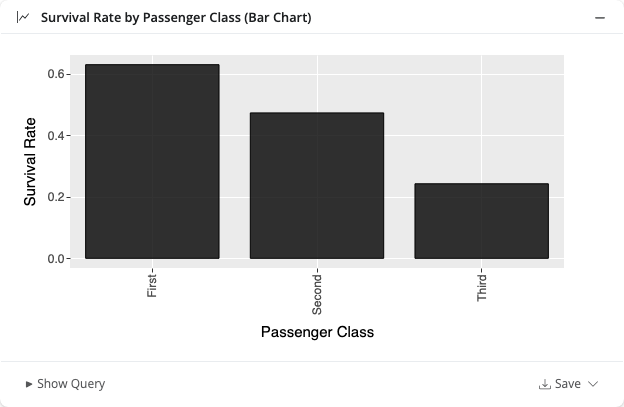
Ask something like “Show me survival rate by passenger class as a bar chart” and querychat will generate and display the chart inline:
Choosing tools
The tools parameter controls which capabilities the LLM has access to. By default, only "query" and "update" are enabled — visualization must be opted into explicitly.
To enable only query and visualization (no dashboard filtering):
qc = QueryChat(titanic(), "titanic", tools=("query", "visualize"))See Tools for a full reference on available tools and what each one does.
Custom apps
The example below shows a minimal custom Shiny app using only the "query" and "visualize" tools. It omits "update" to focus entirely on data analysis and visualization rather than dashboard filtering:
app.py
from pathlib import Path

from querychat.data import titanic
from querychat.express import QueryChat
from shiny.express import ui

greeting = Path(__file__).parent / "greeting-viz.md"

# Omits "update" tool — this demo focuses on query + visualization only
qc = QueryChat(
    titanic(),
    "titanic",
    greeting=greeting,
    tools=("query", "visualize"),
)

qc.ui()

ui.page_opts(fillable=True, title="QueryChat Visualization Demo")
What you can ask for
querychat can generate a wide range of chart types. Some example prompts:
- “Show me a bar chart of survival rate by passenger class”
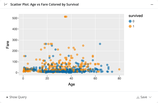
- “Scatter plot of age vs fare, colored by survival”
- “Line chart of average fare over time”
- “Histogram of passenger ages”
- “Facet survival rate by class and sex”
The LLM chooses an appropriate chart type based on your question, but you can always be specific. If you ask for a bar chart, you’ll get a bar chart.
If you don’t like the chart, ask the LLM to adjust it — for example, “make the dots bigger” or “use a log scale on the y-axis”.
Chart controls
Each chart has controls in its footer:
Fullscreen — Click the expand icon to view the chart in fullscreen mode.

Save — Download the chart as a PNG or SVG file.
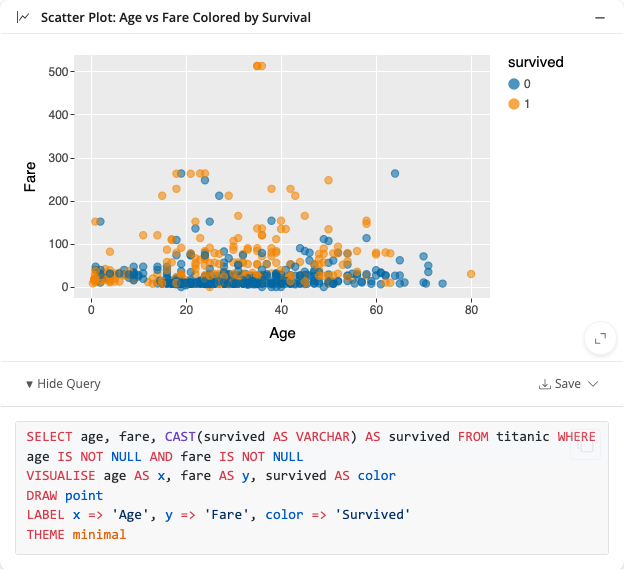
Show Query — Expand the footer to see the ggsql query used to generate the chart.
How it works
- The LLM generates a ggsql query — a SQL-like grammar that describes both data transformation and visual encoding in a single statement.
- The SQL is executed — querychat runs the data portion of the query against your data source locally.
- The VISUALISE clause is rendered — the result is passed to Altair, which produces a Vega-Lite chart specification.
- The chart appears inline — the chart is streamed back into the conversation as an interactive widget.
Note that visualization queries are independent of any active dashboard filter set by the update tool. They always run against the full dataset.
Learn more about the ggsql grammar at ggsql.org.
See also
- Tools — Understand what querychat can do under the hood
- Provide context — Help the LLM understand your data better