Shiny is a web framework for building interactive data applications. It provides a reactive programming model that’s a natural fit for querychat.
In this guide, you’ll learn how to build Shiny apps with querychat to enable rich data exploration experiences where data views update based on natural language filters.
Initialize QueryChat
The “main” QueryChat class is available directly from the top-level module, and it designed to work with Shiny (Core):
from querychat import QueryChat
For Shiny Express, import from querychat.express instead (similar to how you import from shiny.express):
from querychat.express import QueryChat
Once imported, initialize it with your data source:
from querychat.data import titanicqc = QueryChat(titanic(), "titanic")
Visualization support
querychat supports an optional visualization tool that lets the LLM create inline charts. Enable it by including "visualize" in the tools parameter. See Visualizations for details.
Quick start with .app()
Remember, the simplest way to get started is with .app(), which gives a “pre-baked” Shiny app:
After initializing QueryChat, use .sidebar() or .ui() to place the chat interface in your app. As users interact with the chat, .df(), .sql(), and .title() automatically update to reflect the current query. Any Shiny outputs that depend on these reactive values will re-render automatically.
Method
Description
.sidebar()
Place the chat interface in a sidebar
.ui()
Returns just the chat component for custom placement
.df()
Current filtered/sorted DataFrame
.sql()
Current SQL query (str | None)
.title()
Short description of current filter (str | None)
Note
Shiny has two modes: Express (simple, script-based) and Core (explicit UI/server separation). With Core, call qc.server() in your server function and access reactives via the returned object (e.g., qc_vals.df()). With Express, access them directly on the QueryChat instance (e.g., qc.df()).
Basic sidebar
The most common pattern places chat in the sidebar with your custom filtered views in the main area:
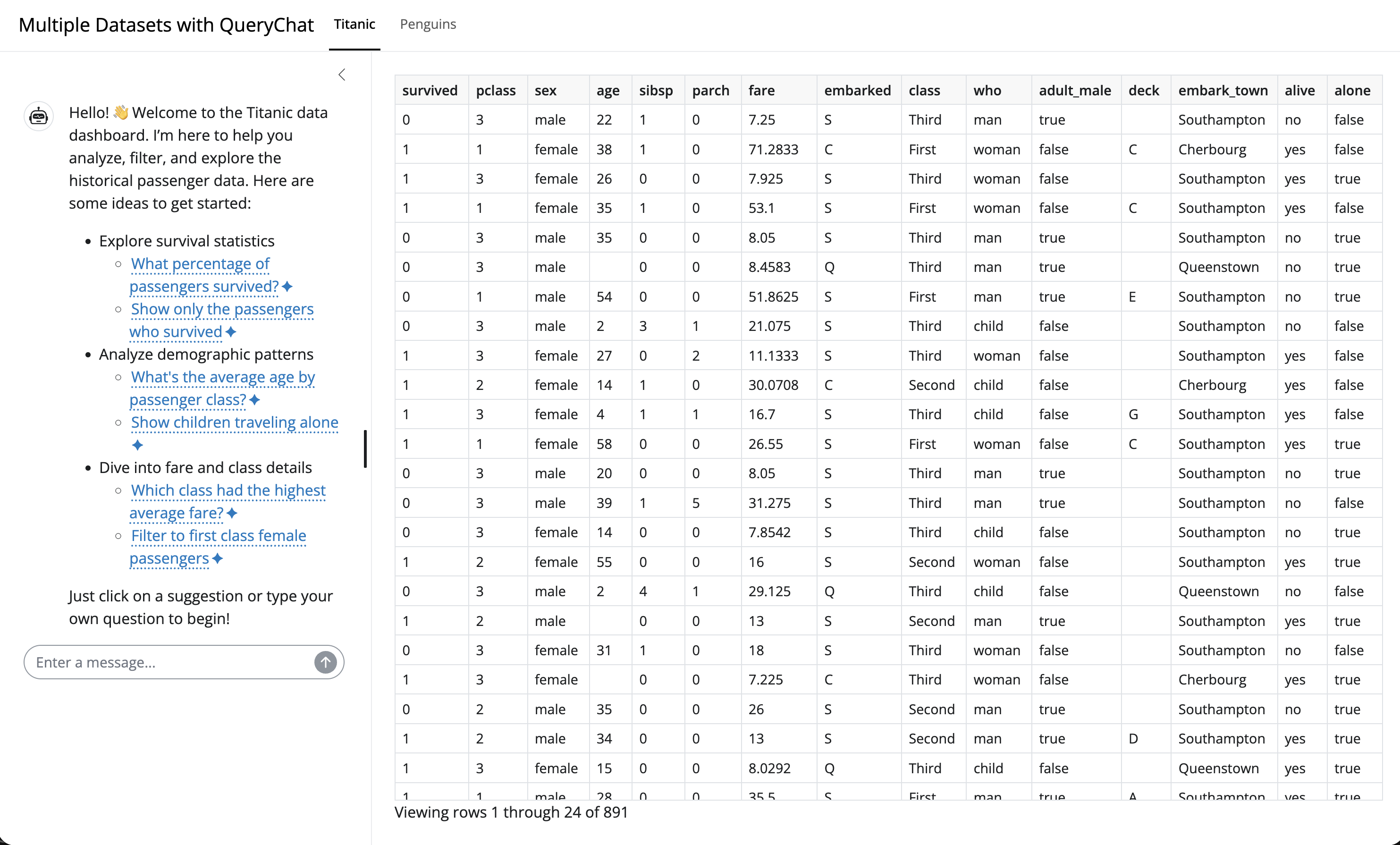
from pathlib import Pathfrom shiny.express import render, uifrom querychat.express import QueryChatfrom querychat.data import titanicgreeting = Path(__file__).parent /"greeting.md"# 1. Provide data source to QueryChatqc = QueryChat(titanic(), "titanic", greeting=greeting)# 2. Add sidebar chat controlqc.sidebar()# 3. Add a card with reactive title and data framewith ui.card():with ui.card_header():@render.textdef title():return qc.title() or"Titanic Dataset"@render.data_framedef data_table():return qc.df()# 4. Set some page options (optional)ui.page_opts( fillable=True, title="Titanic Dataset Explorer")
Deferred data sources
Some data sources, like database connections or reactive calculations, may need to be created within an active Shiny session. To help support this, QueryChat allows you to initialize without a data source and provide it later, like this:
deferred-app.py
from shiny.express import render, session, uifrom querychat.express import QueryChat# Don't create connection until we have an actual sessionif session.is_stub_session(): conn =Noneelse: conn = get_user_connection(session)qc = QueryChat(conn, "users")qc.sidebar()@render.data_framedef table():return qc.df()
from pathlib import Pathfrom shiny import App, render, uifrom querychat import QueryChatfrom querychat.data import titanicgreeting = Path(__file__).parent /"greeting.md"# 1. Provide data source to QueryChatqc = QueryChat(titanic(), "titanic", greeting=greeting)app_ui = ui.page_sidebar(# 2. Create sidebar chat control qc.sidebar(), ui.card( ui.card_header(ui.output_text("title")), ui.output_data_frame("data_table"), fill=True, ), fillable=True)def server(input, output, session):# 3. Add server logic (to get reactive data frame and title) qc_vals = qc.server()# 4. Use the filtered/sorted data frame reactively@render.data_framedef data_table():return qc_vals.df()@render.textdef title():return qc_vals.title() or"Titanic Dataset"app = App(app_ui, server)
Deferred data sources
Some data sources, like database connections or reactive calculations, may need to be created within an active Shiny session. To help support this, QueryChat allows you to initialize without a data source and provide it later, like this:
deferred-app.py
from shiny import App, uifrom querychat import QueryChat# Global scope - create QueryChat without data sourceqc = QueryChat(None, "users")app_ui = ui.page_sidebar( qc.sidebar(), ui.output_data_frame("table"),)def server(input, output, session):# Server scope - create connection with session credentials conn = get_user_connection(session) qc_vals = qc.server(data_source=conn)@render.data_framedef table():return qc_vals.df()app = App(app_ui, server)
If your chat client also depends on session-scoped credentials, you can defer that too by passing it to qc.server(client=...) alongside the data_source.
Custom chat UI
Use .ui() to place the chat anywhere in your layout. Here we use it simply to place custom content in the sidebar alongside the chat (like a reset button):
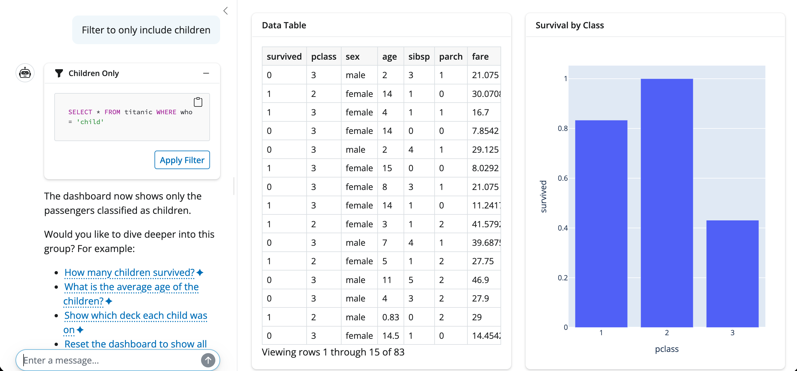
Users can also ask the LLM to “reset” or “show all data” to clear filters through the chat interface.
Programmatic updates
You can update the query state programmatically using .sql() and .title() as setters. This is useful for adding preset filter buttons or linking filters to other UI controls.
Multiple tables
querychat can work with multiple related tables in a single chat interface, letting users query across tables, join data, and filter any table independently. Register additional tables with .add_table() after creating the QueryChat instance, then access per-table state through the .table() method.
Registering tables
Pass the first table when creating QueryChat, then call .add_table() for each additional table:
from querychat import QueryChatqc = QueryChat(orders, "orders")qc.add_table(customers, "customers")qc.add_table(products, "products")
If your data lives in a SQLAlchemy engine or Ibis backend, use .add_tables() to register all tables in a single call:
from sqlalchemy import create_engineimport ibis# SQLAlchemyengine = create_engine("sqlite:///store.db")qc = QueryChat()qc.add_tables(engine) # all tablesqc.add_tables(engine, ["orders", "customers"]) # specific subset# Ibisbackend = ibis.duckdb.connect("store.duckdb")qc = QueryChat()qc.add_tables(backend) # all tablesqc.add_tables(backend, ["orders", "customers"]) # specific subset
The LLM can query any registered table and write joins across them. You can inspect which tables are registered with qc.table_names().
Per-table reactive access
When working with multiple tables, access filtered data and SQL for each table individually using .table():
Each table has its own .df(), .sql(), and .title() reactives that update independently when the user filters that specific table.
Tracking the active table
Use .current_table() to find out which table the LLM most recently queried. This is useful for auto-switching a tabbed UI to the relevant table:
@reactive.effectdef _(): name = qc_vals.current_table()if name: ui.update_navs("table_tabs", selected=name)
Data dictionary
When working with multiple related tables, providing a data dictionary is strongly recommended. It tells the LLM how tables relate to each other, which columns are keys, and what domain terms mean — all of which help it write accurate joins and queries.
from pathlib import Pathqc = QueryChat(orders, "orders", data_dict=Path("data-dict.yaml"))qc.add_table(customers, "customers")