library(dplyr)
library(tibble)
library(purrr)
library(glue)
library(cli)
library(ggplot2)
library(tidyr)
library(sf)

catchment_panel <- readRDS("catchment_panel.rds")
sim_result <- readRDS("sim_result.rds")
per_station <- readRDS("per_station.rds")
catchments <- readRDS("catchments.rds")Results, figures, and the record
Stage seven: answering the question, and being able to answer it again
Draft. The code runs and the argument holds; the prose has not been copy-edited.
By this stage nothing is special. The data is in the session, Databricks is no longer involved, and what follows is the R you would write for any other project.
The answer
The question from The question, and the data was whether catchments with more storm overflows show more variable river flow.
model_data <- catchment_panel |>
  filter(
    !is.na(median_cv),
    !is.na(overflow_density),
    is.finite(overflow_density)
  )

fit <- lm(
  median_cv ~ log1p(overflow_density),
  data = model_data
)

summary(fit)$coefficients
Estimate Std. Error t value Pr(>|t|)
(Intercept) 1.1770551 0.01810351 65.018068 1.976263e-323
log1p(overflow_density) 0.1225715 0.08190415 1.496523 1.349078e-01slope <- coef(fit)[["log1p(overflow_density)"]]
p_value <- summary(fit)$coefficients[2, 4]
n_used <- nrow(model_data)
cli_alert_info(
"slope {round(slope, 3)} on {n_used} catchments, \\
p = {signif(p_value, 2)}"
)ℹ slope 0.123 on 810 catchments, p = 0.13Stated plainly: across these catchments the association between overflow density and flow variability is weak, and the coefficient is small relative to the spread in the data.
This is not a finding about rivers. The grade column is a substitute for one that turned out to be unusable, the catchments are those that happen to contain a gauging station, and no confounder is controlled for. The number exists to show that the machinery produced a number. The data and its licences says why the whole example is a vehicle.
The figure
Ordinary ggplot2 on an ordinary data frame.
ggplot(
  model_data,
  aes(overflow_density, median_cv)
) +
  geom_point(alpha = 0.35, colour = "#447099") +
  geom_smooth(
    method = "lm",
    formula = y ~ log1p(x),
    colour = "#EE6331",
    se = TRUE
  ) +
  scale_x_continuous(trans = "log1p") +
  labs(
    x = "storm overflows per km²",
    y = "median coefficient of variation of daily flow"
  ) +
  theme_minimal(base_size = 11)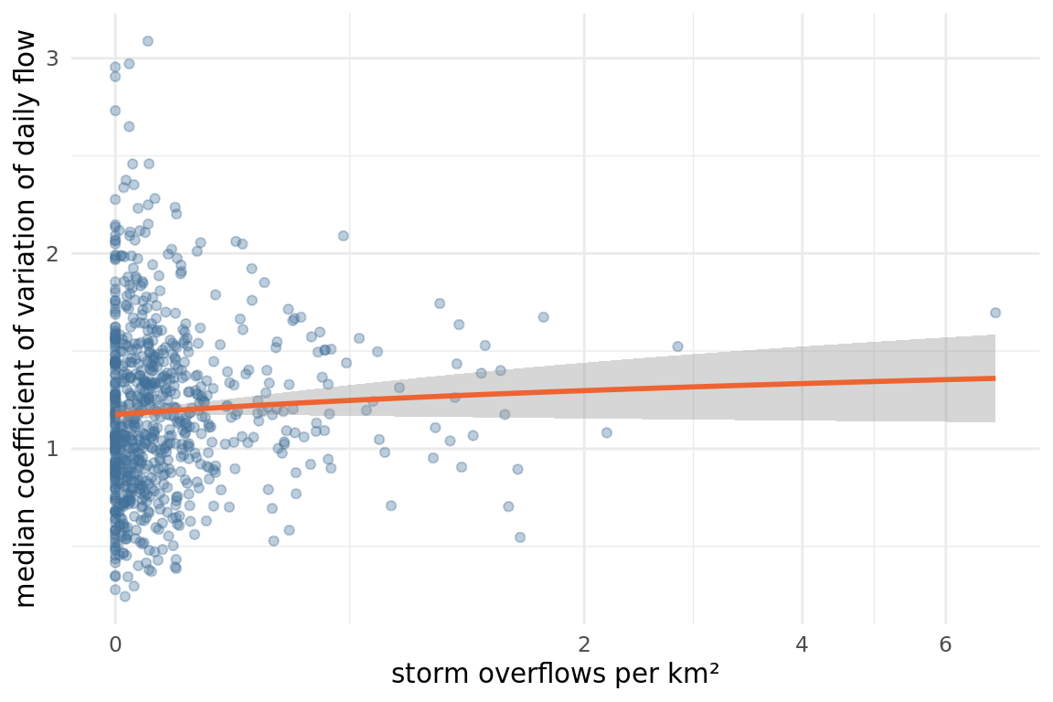
The same two quantities on the map say something the scatter cannot, which is how much of the country the analysis never saw. The filled catchments are the 810 with a gauging station in them; the grey ones are the other 3,270. That is the selection effect named above, drawn rather than asserted.
catchment_map <- catchments |>
  select(water_body_id, geometry) |>
  left_join(
    catchment_panel |>
      select(water_body_id, median_cv, overflow_density),
    by = "water_body_id"
  ) |>
  pivot_longer(
    c(median_cv, overflow_density),
    names_to = "measure",
    values_to = "value"
  ) |>
  mutate(
    measure = recode(
      measure,
      median_cv = "flow variability (median CV)",
      overflow_density = "storm overflows per km²"
    )
  ) |>
  group_by(measure) |>
  mutate(rank = percent_rank(value)) |>
  ungroup()

ggplot(catchment_map) +
  geom_sf(data = ~filter(.x, is.na(rank)), fill = "#E8E8E8", colour = NA) +
  geom_sf(aes(fill = rank), colour = NA) +
  facet_wrap(~measure) +
  scale_fill_viridis_c(
    direction = -1,
    na.value = "#E8E8E8",
    name = "percentile within measure",
    labels = scales::percent,
    breaks = c(0, 0.25, 0.5, 0.75, 1)
  ) +
  coord_sf(crs = 27700, datum = 27700) +
  theme_void(base_size = 9) +
  theme(
    legend.position = "bottom",
    legend.key.width = unit(1.4, "cm"),
    legend.title = element_text(size = 8)
  )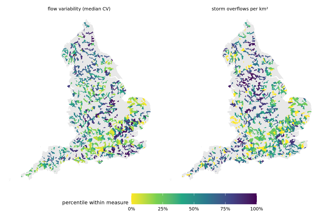
The fill is each catchment’s rank within its own measure rather than its value, because the two measures have different units and a shared value scale would flatten one of them. Both quantities do vary: median CV spans about two and a half fold between its tenth and ninetieth percentiles, and overflow density runs from zero to nearly seven per km². The ranking makes that variation comparable across the two panels without implying the two numbers are on one scale.
The second figure is the one from the simulation, and it is worth keeping because it shows the uncertainty rather than a point estimate.
Ordering matters here. Every station’s central estimate sits near 36.5 days by construction, so sorting by the mean puts the intervals in effectively random order and the figure says only that they differ. Sorting by interval width instead shows the thing that varies, and the forty are drawn evenly across the full range of widths rather than from the top of it, because the widest forty are all much the same.
sim_result |>
  mutate(width = upper - lower) |>
  arrange(desc(width)) |>
  slice(round(seq(1, n(), length.out = 40))) |>
  mutate(
    station_id = factor(station_id, levels = station_id)
  ) |>
  ggplot(aes(mean_days, station_id)) +
  geom_linerange(
    aes(xmin = lower, xmax = upper),
    colour = "#A2B8CB"
  ) +
  geom_point(colour = "#447099", size = 1) +
  labs(
    x = "simulated low-flow days per year",
    y = NULL
  ) +
  theme_minimal(base_size = 9) +
  theme(axis.text.y = element_blank())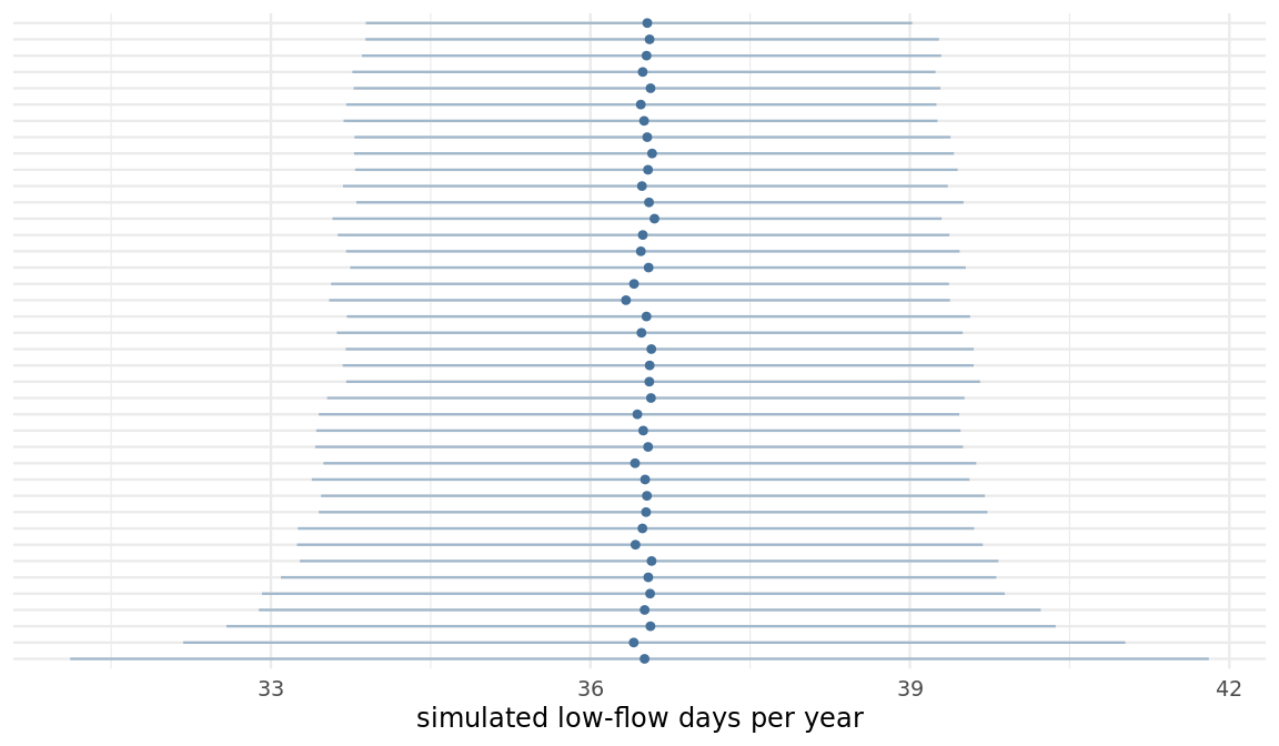
Writing results back
Two routes, and the choice is not a matter of taste.
A results table this size, a few hundred rows, goes back over dbWriteTable() without trouble. The route stops working at about 50,000 rows, where it turns into a hard error rather than a slow write, and the fix is the volume-and-read_files() path that Getting the data into Databricks uses for the same reason in the other direction.
# A small results table: this is fine.
dbWriteTable(
  con,
  DBI::Id(
    catalog = catalog,
    schema = schema,
    table = "flow_variability_results"
  ),
  model_data,
  overwrite = TRUE
)
For this analysis the results stay local, because nothing downstream reads them from Databricks. Writing back is worth doing when a colleague or a dashboard needs the table, and not otherwise.
model_data |>
  select(
    water_body_id,
    water_body_name,
    ecological_class,
    n_overflows,
    area_km2,
    overflow_density,
    median_cv
  ) |>
  saveRDS("flow_variability_results.rds")
The credit lines
Both licences, worded exactly. This is the page to copy from into a paper, and the two are not the same licence.
Contains public sector information licensed under the Open Government Licence v3.0. Source: Environment Agency hydrology data.
Storm overflow outfall locations © the water companies, licensed under CC BY 4.0 and published via Stream / Water UK’s National Storm Overflow Hub.
The hydrology and catchment data is OGL v3.0. The storm overflow locations are CC BY 4.0, not OGL, and they are operational rather than regulatory data. CC BY requires attribution in a way OGL does not, so the distinction has to survive into anything published from this.
What it would take to run this again next year
The honest version.
What is pinned: the table schemas, the catalog and schema names read from the environment, and the queries themselves. Re-running the SQL against next year’s data gives next year’s answer with no code change.
What is partly pinned: the R package versions in this session. This project has an renv.lock, so restoring it gives you the same package versions the pages were rendered with. That is worth having and it is not the whole problem, because a lockfile describes one of the three environments this analysis runs in.
What is not pinned: the runtime version on the cluster, and the packages installed on the workers. Neither is visible to renv, and no lockfile can reach them.
What is open rather than solved:
- The worker boundary. The packages on the cluster’s workers are whatever an administrator installed. Nothing in this repository pins them, and nothing here can detect a change short of running the job and comparing the answer.
- Seeds across the boundary. The simulations seed per unit of work, so they reproduce for a fixed set of units. They do not reproduce if the partitioning changes, because the partitioning decides which units share a worker.
- The upstream data. The hydrology API serves current data, and a station’s record can be revised. Re-running the ingest is not guaranteed to reproduce the same table.
Get results out, and get the same answer next year covers what to do about each. None of it is settled here.
What this example did not cover
A short list, so the boundary is visible: rasters, scheduling, streaming, and anything the analysis did not happen to need.
Two things the example did reach and could not settle. How the distributed stage behaves at more than two worker machines is untested, so nothing on this site claims a scaling property. And the grouped form of the distributed call could not be measured at all, because it does not run on a current runtime.
One thing it reached and had to work around: on the Databricks Connect backend, spark_apply() does not carry the calling environment to the worker, so geometry had to travel as a column rather than in the closure. When the simulation carries the geometry shows the route that works.
This page rests on: dbWriteTable() fails hard at about 50,000 rows, so a large result needs the volume route; environmental agency data is OGL v3.0 while storm overflow locations are CC BY 4.0; an renv.lock pins this session’s package versions but reaches neither the cluster runtime nor the worker library; per-unit seeding reproduces only for a fixed partitioning.