Supported By Posit Badge 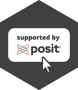
The “Supported by Posit” badge is a clickable element that can be added to Quarto and pkgdown websites to indicate that Posit, PBC supports the project. It appears on the far right of the top navigation bar or at the bottom of the hamburger menu. It links to Posit’s Open Source website.
Featured Websites
The following websites have the “Supported by Posit” badge: dplyr, ggplot2, Great Tables, gt, lubridate, mirai, nanonext, pkgdown Plotnine, Pointblank, pointblank, purrr, Quarto, Shiny, and many others.
Installation
The badge is implemented as a single JavaScript file that can be easily added to any Quarto or pkgdown website. To add the badge, include the following in your _quarto.yml or _pkgdown.yml file:
format:
  html:
    include-in-header:
      - text: |
<script src="https://cdn.jsdelivr.net/gh/posit-dev/supported-by-posit/js/badge.min.js"></script>template:
includes:
in_header: |
<script src="https://cdn.jsdelivr.net/gh/posit-dev/supported-by-posit/js/badge.min.js"></script>Customization
If the default colors or settings don’t match your website’s design, you can customize the badge. The badge supports customization of the background color, foreground color, whether it should be hidden below a certain width to accommodate crowded navigation headers, the left margin, and the maximum height.
Note: Dark mode colors are ignored if your website only supports light mode.
format:
  html:
    include-in-header:
      - text: |
          <script src="https://cdn.jsdelivr.net/gh/posit-dev/supported-by-posit/js/badge.min.js"
                  data-light-bg="#ffffff"
                  data-light-fg="#404041"
                  data-dark-bg="#404041"
                  data-dark-fg="#ffffff"
                  data-hide-below="992"
                  data-margin-left="10"
data-max-height="54"></script>template:
includes:
in_header: |
<script src="https://cdn.jsdelivr.net/gh/posit-dev/supported-by-posit/js/badge.min.js"
data-light-bg="#ffffff"
data-light-fg="#404041"
data-dark-bg="#404041"
data-dark-fg="#ffffff"
data-hide-below="992"
data-margin-left="10"
data-max-height="54"></script>Best Practice: Only include the data-* attributes for colors and settings you want to override from the defaults.
To comply with Posit’s brand guide, please choose from the following colors:
- Background color (
data-*-bg): Any color that provides adequate contrast with the text and the logo - Foreground color (
data-*-fg): Either#404041or#ffffff
For questions, message the #supported-by-posit channel on Slack.
Testing
You can test how the badge will look on your website before making permanent changes by using your browser’s JavaScript Console.
// Step 1: Load the Badge Script
script = document.createElement('script');
script.src = 'https://cdn.jsdelivr.net/gh/posit-dev/supported-by-posit/js/badge.min.js';
document.head.appendChild(script);

// Step 2: Test Different Settings
addSupportedByPositBadge({
  'lightBg': '#ffffff',
  'lightFg': '#404041',
  'darkBg': '#404041',
  'darkFg': '#ffffff',
  'hideBelow': 992,
  'marginLeft': 10,
  'maxHeight': 54
});
Important: All parameters must be provided when calling the addSupportedByPositBadge() function. Once you’re satisfied, add only the non-default ones to your <script> tag using the data-* attributes shown in the customization section.
Deploying
When the script itself is updated on GitHub, purge the CDN cache to ensure users receive the latest version. To purge the script, visit: purge.jsdelivr.net/gh/posit-dev/supported-by-posit/js/badge.min.js.