Hello, dashboards!
Small Data SF
2024-09-23
Step 2: Add a card
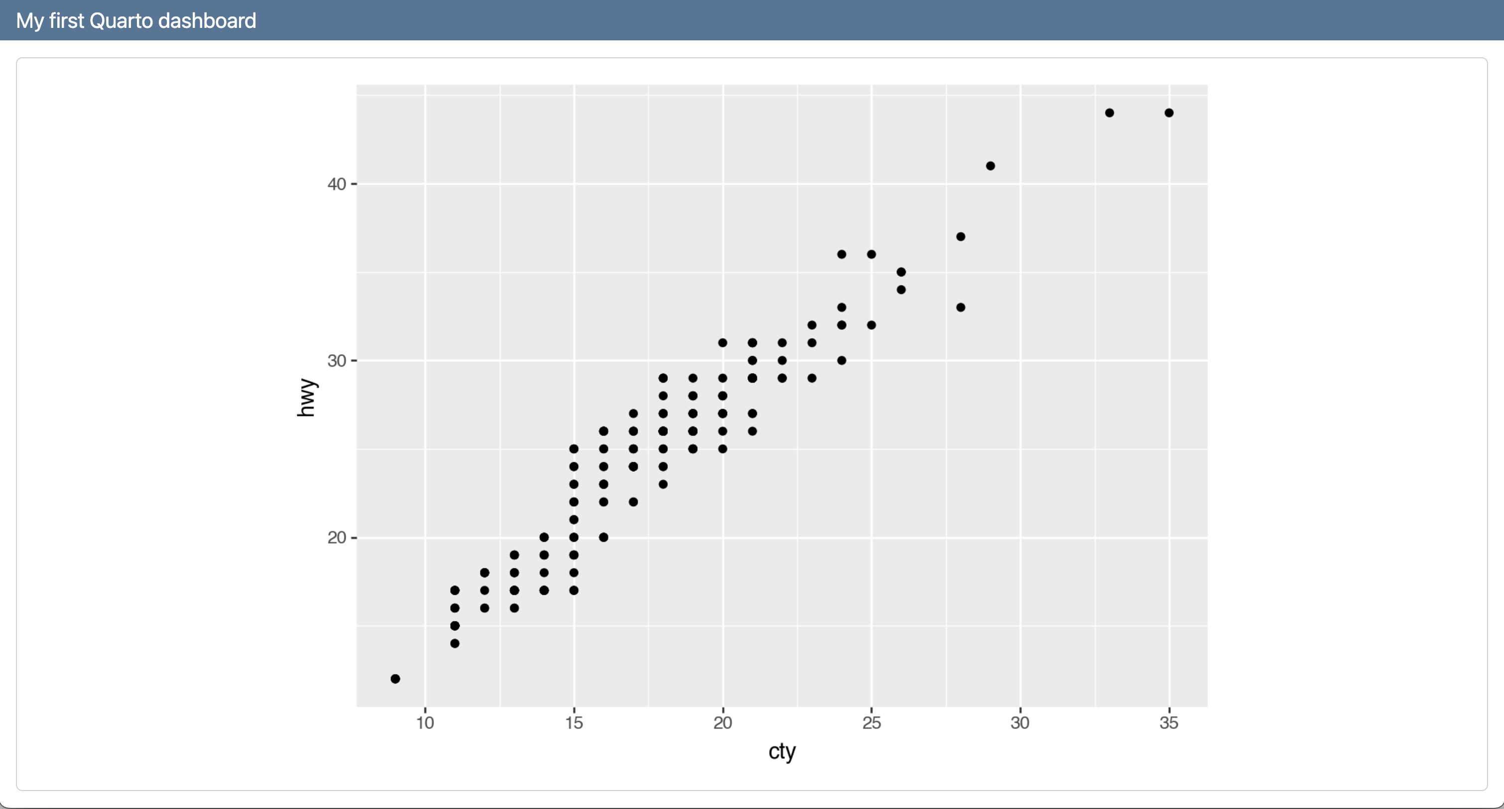
Step 3: Add another card
dashboard.qmd
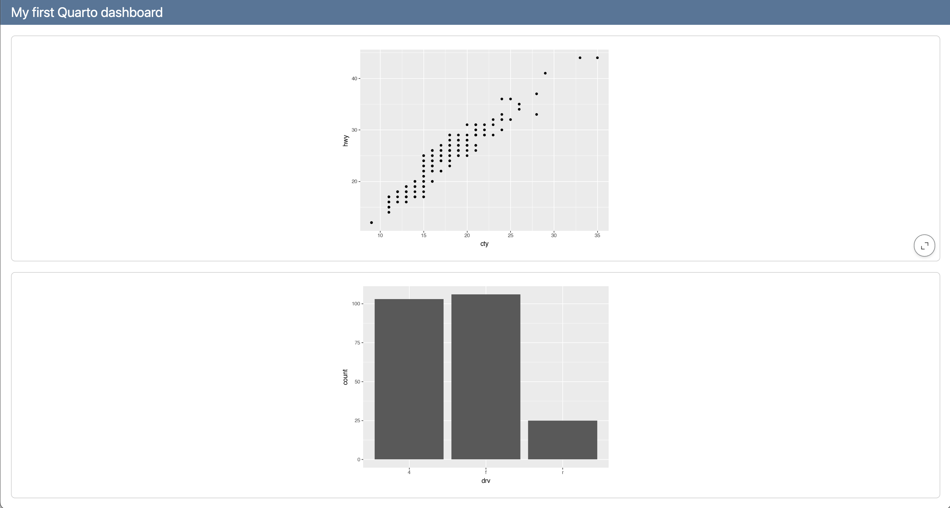
Step 4: Add titles to cards
dashboard.qmd
---
title: "My first Quarto dashboard"
format: dashboard
---
```{python}
from plotnine import ggplot, aes, geom_point, geom_bar
from plotnine.data import mpg
```
```{python}
#| title: Highway vs. city mileage
(
ggplot(mpg, aes(x = "cty", y = "hwy"))
+ geom_point()
)
```
```{python}
#| title: Drive types
(
ggplot(mpg, aes(x = "drv"))
+ geom_bar()
)
```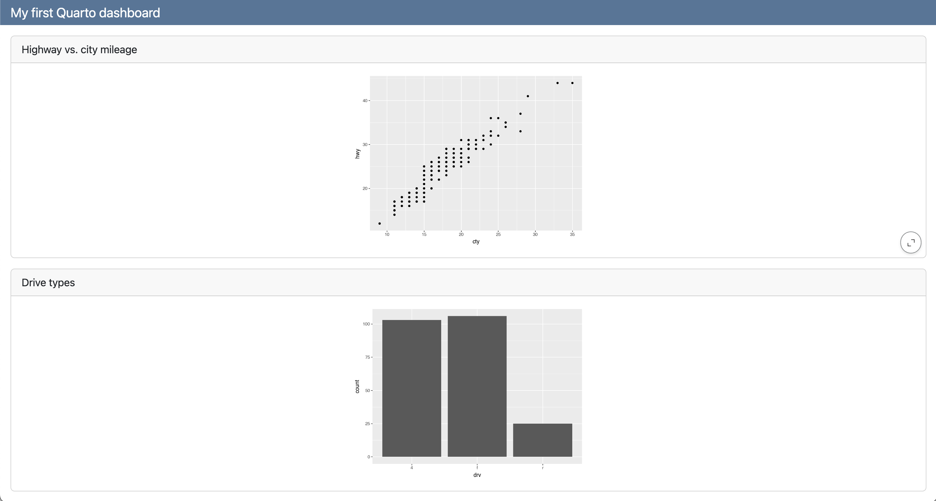
Step 5: Add a logo
dashboard.qmd
---
title: "My first Quarto dashboard"
format:
  dashboard:
    logo: images/beetle.png
---

```{python}
from plotnine import ggplot, aes, geom_point, geom_bar
from plotnine.data import mpg
```

```{python}
#| title: Highway vs. city mileage
(
    ggplot(mpg, aes(x = "cty", y = "hwy"))
    + geom_point()
)
```

```{python}
#| title: Drive types
(
    ggplot(mpg, aes(x = "drv"))
    + geom_bar()
)
```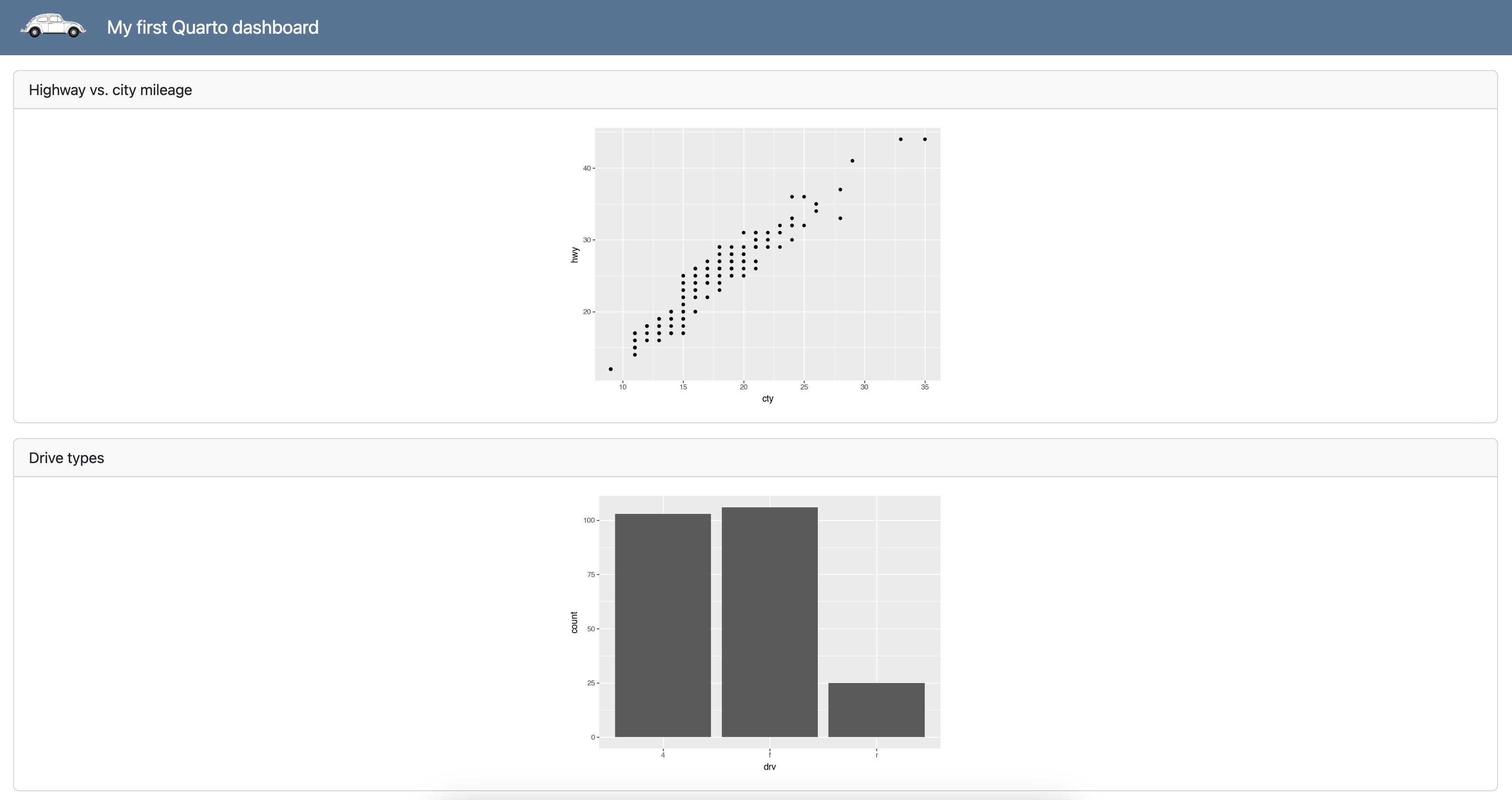
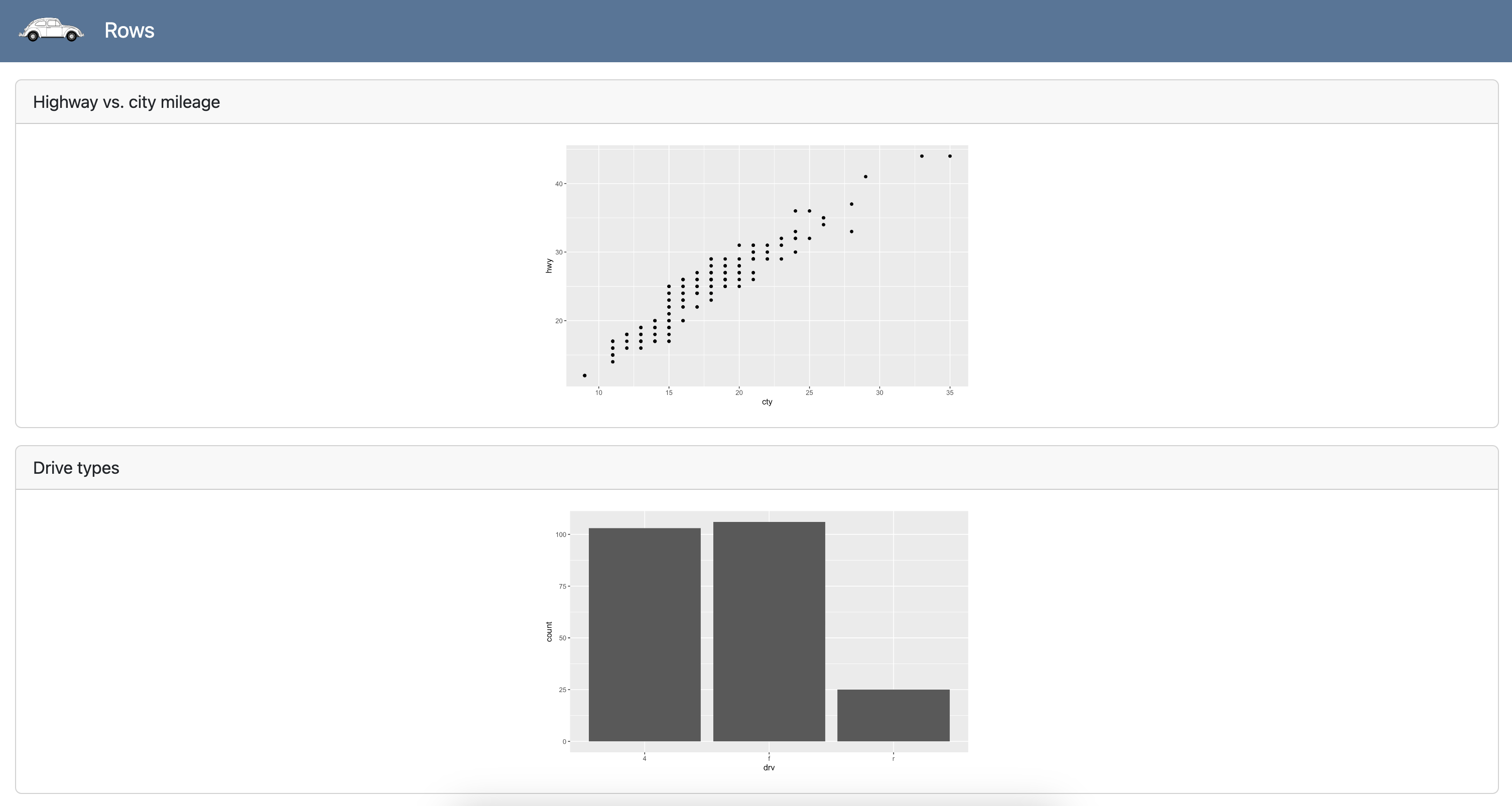
Steps 1 - 5
Rows
dashboard.qmd
---
title: "Rows"
format:
  dashboard:
    logo: images/beetle.png
---

```{python}
from plotnine import ggplot, aes, geom_point, geom_bar
from plotnine.data import mpg
```

## Scatter

```{python}
#| title: Highway vs. city mileage
(
    ggplot(mpg, aes(x = "cty", y = "hwy"))
    + geom_point()
)
```

## Bar

```{python}
#| title: Drive types
(
    ggplot(mpg, aes(x = "drv"))
    + geom_bar()
)
```
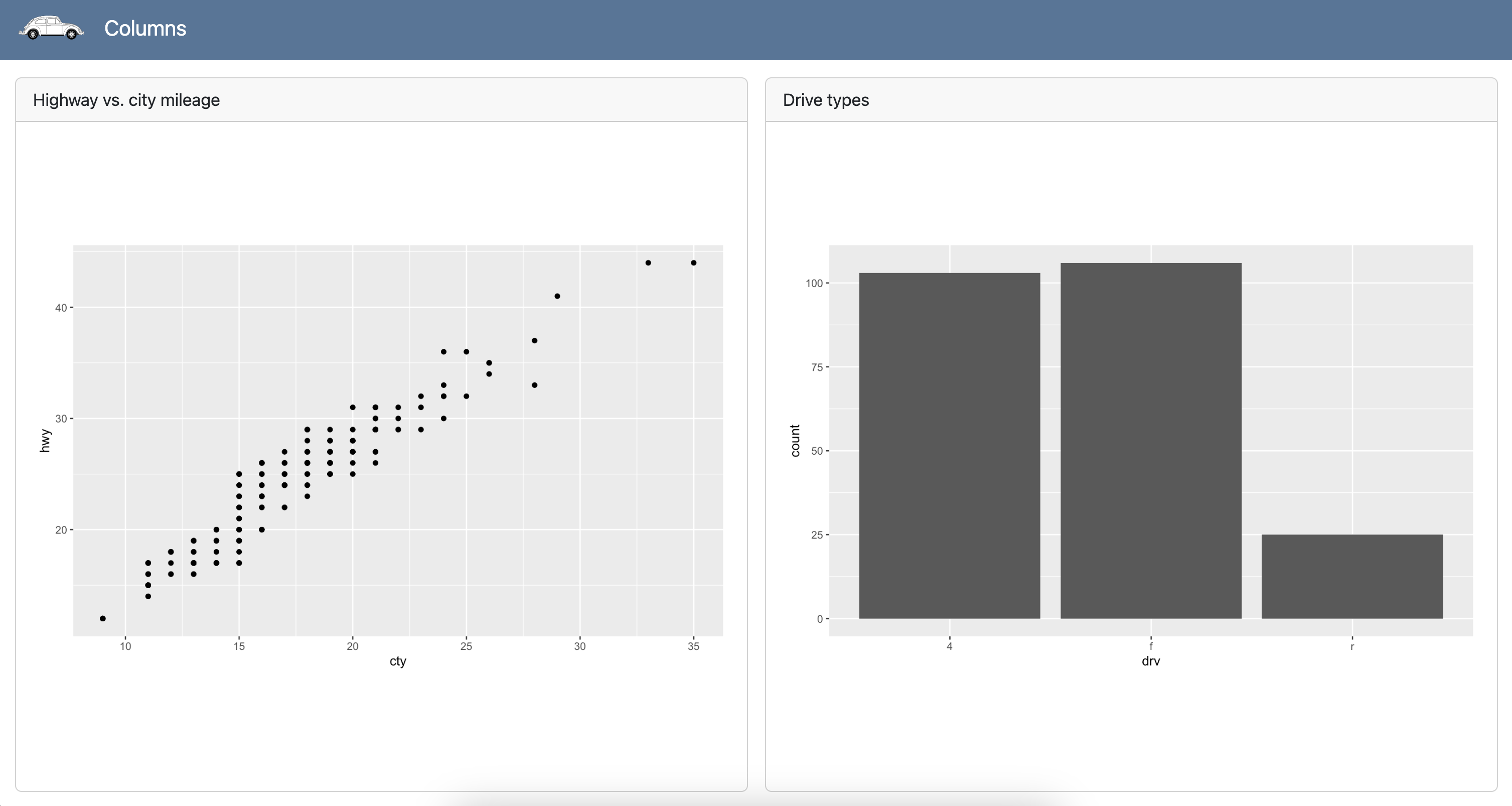
Columns
dashboard.qmd
---
title: "Columns"
format:
  dashboard:
    orientation: columns
    logo: images/beetle.png
---

```{python}
from plotnine import ggplot, aes, geom_point, geom_bar
from plotnine.data import mpg
```

## Scatter

```{python}
#| title: Highway vs. city mileage
(
    ggplot(mpg, aes(x = "cty", y = "hwy"))
    + geom_point()
)
```

## Bar

```{python}
#| title: Drive types
(
    ggplot(mpg, aes(x = "drv"))
    + geom_bar()
)
```
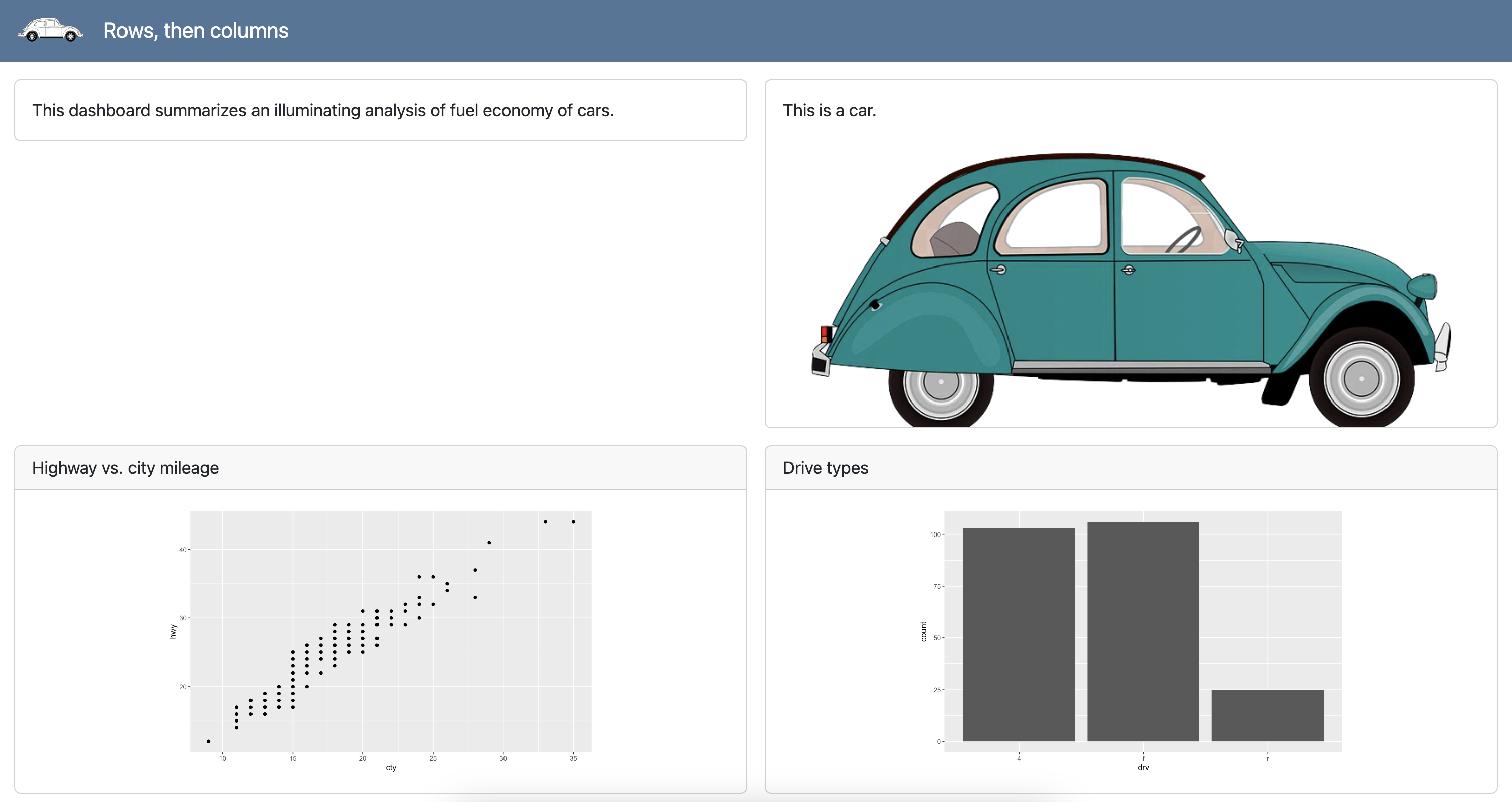
Rows, then columns
dashboard.qmd
---
title: "Rows, then columns"
format:
dashboard:
logo: images/beetle.png
---
```{python}
from plotnine import ggplot, aes, geom_point, geom_bar
from plotnine.data import mpg
```
## Overview
###
This dashboard summarizes an illuminating analysis of fuel economy of cars.
###
This is a car.
{fig-alt="Illustration of a teal color car."}
## Plots
### Scatter
```{python}
#| title: Highway vs. city mileage
(
ggplot(mpg, aes(x = "cty", y = "hwy"))
+ geom_point()
)
```
### Bar
```{python}
#| title: Drive types
(
ggplot(mpg, aes(x = "drv"))
+ geom_bar()
)
```
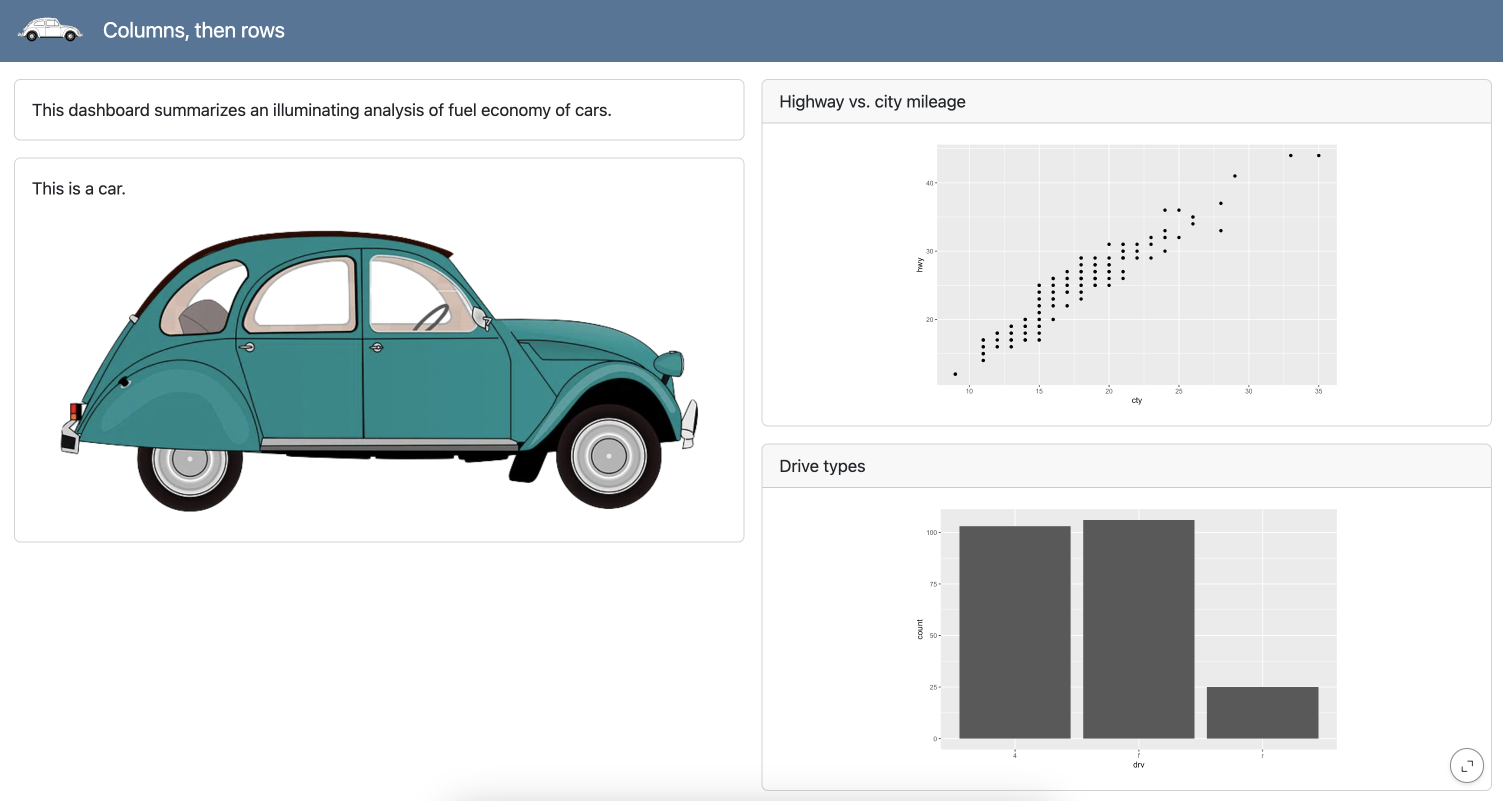
Columns, then rows
dashboard.qmd
---
title: "Rows, then columns"
format:
dashboard:
orientation: columns
logo: images/beetle.png
---
```{python}
from plotnine import ggplot, aes, geom_point, geom_bar
from plotnine.data import mpg
```
## Overview
###
This dashboard summarizes an illuminating analysis of fuel economy of cars.
###
This is a car.
{fig-alt="Illustration of a teal color car."}
## Plots
### Scatter
```{python}
#| title: Highway vs. city mileage
(
ggplot(mpg, aes(x = "cty", y = "hwy"))
+ geom_point()
)
```
### Bar
```{python}
#| title: Drive types
(
ggplot(mpg, aes(x = "drv"))
+ geom_bar()
)
```
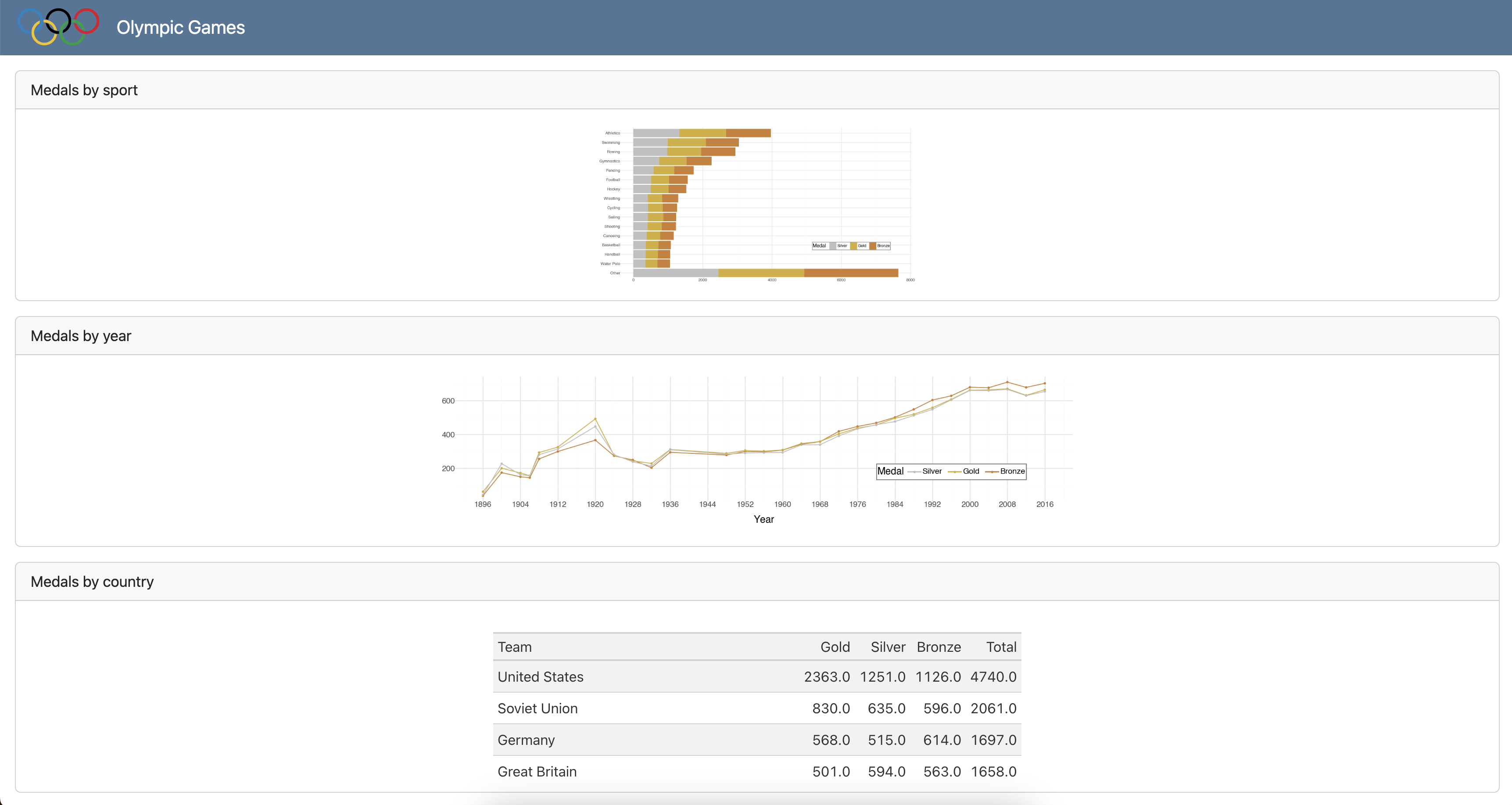
Goal
Your goal is to create the following dashboard.
Step 1
- Turn the output to a dashboard.
- Add
titles to code cells. - Add the Olympics logo from the
imagesfolder
05:00
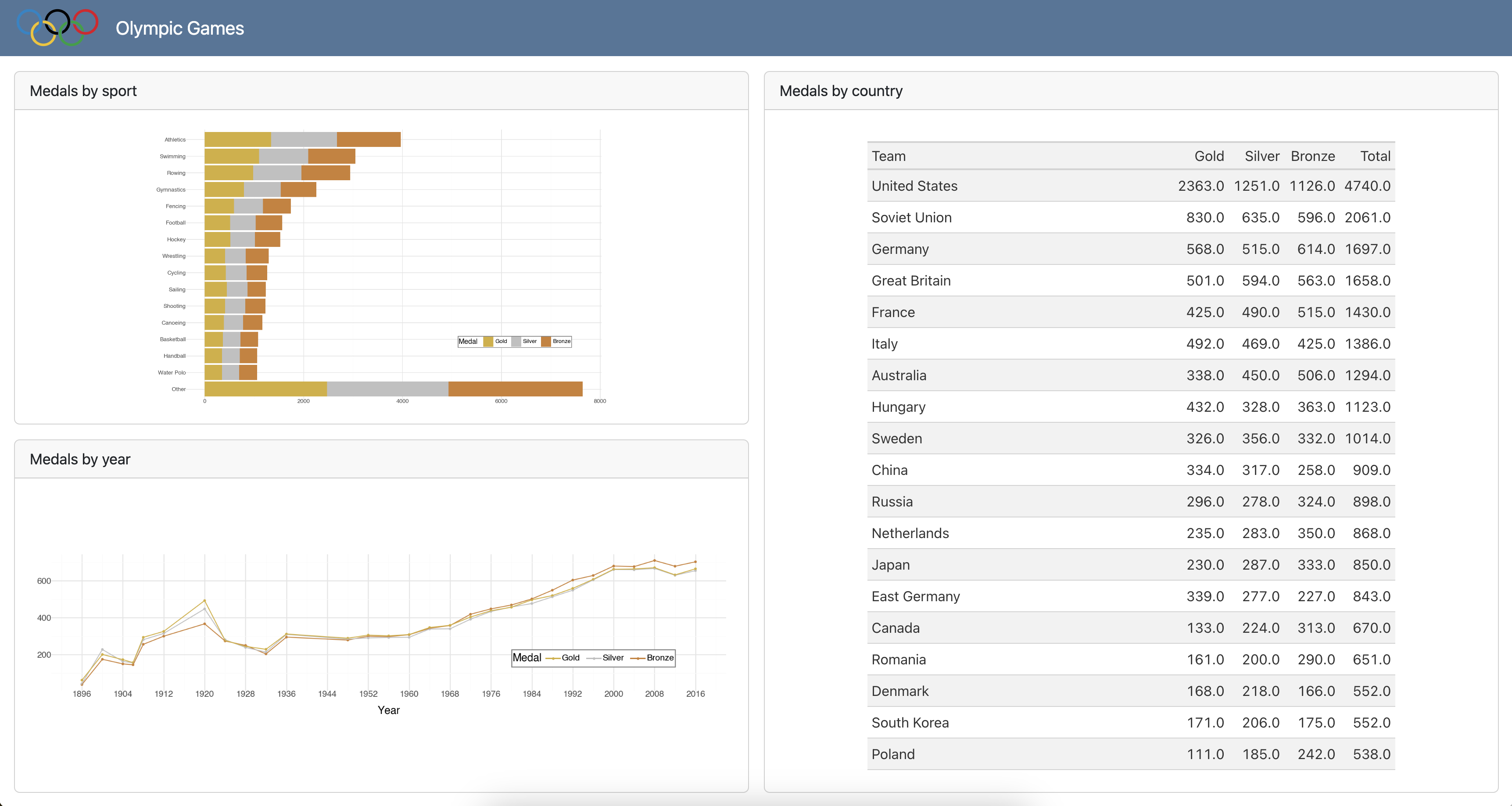
Step 2
Reorganize the cards into rows and columns as shown below.
05:00